Typography plays a crucial role in web design, influencing both aesthetics and readability. As we move through 2024, the trends in font pairings continue to evolve, offering opportunities to enhance your website’s visual appeal. In this article, we’ll explore five fantastic font pairings that will elevate your website design and keep it looking modern and professional.
Lufga (Bold) and Proxima Nova Font Pairing
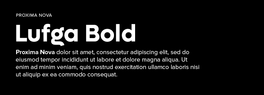
As of July 2024, this website is pairing Lufga and Proxima Nova. Any web designer and developer who’s been around for more than a couple days is familiar with Proxima Nova, however, I recently stumbled upon Lufga on Behance and instantly fell in love. Pairing fonts is an art that balances aesthetics and functionality. The combination of Lufga and Proxima Nova is a versatile and contemporary choice that brings a unique flavor to web design.
Lufga: The Modern Geometric Serif
Lufga is a modern geometric serif font known for its clean lines and distinct character shapes. It combines the elegance of serif fonts with the precision of geometric design, making it a striking choice for headlines and titles. Lufga’s bold and structured appearance grabs attention and sets a sophisticated tone for your website.
Proxima Nova: The Versatile Sans-Serif
Proxima Nova is a popular sans-serif font celebrated for its readability and modern appeal. It offers a wide range of weights and styles, making it highly adaptable for various design needs. Proxima Nova’s clean and straightforward design makes it an excellent choice for body text, ensuring that content is easy to read across different devices and screen sizes.
Why This Pairing Works
- Contrast and Harmony: The geometric precision of Lufga contrasts beautifully with the clean simplicity of Proxima Nova. This contrast helps to create a visual hierarchy, guiding the reader’s eye through the content.
- Modern and Professional: Both fonts share a modern aesthetic, making them suitable for contemporary web designs. They can be used across various industries, from tech startups to creative portfolios.
- Readability: Proxima Nova’s clarity and readability make it perfect for longer text passages, while Lufga’s distinctive style makes headlines and titles stand out without compromising on legibility.
Use Case Scenarios
- Tech Blogs and Articles: Use Lufga for article titles and section headings to make a bold statement. Proxima Nova can then be used for the body text, ensuring that the content remains easy to read.
- Corporate Websites: Lufga can be utilized in the hero sections, creating an impactful first impression, while Proxima Nova handles the main content and navigation elements.
- Creative Portfolios: Showcase your projects with Lufga as the project titles and Proxima Nova for descriptions and case studies. This pairing highlights your work while maintaining a professional look.
Sample Implementation
- Headlines (H1, H2, H3): Apply Lufga to bring focus and style to your headings.
- Body Text (P, Span): Use Proxima Nova for paragraphs, ensuring clean and readable content.
- Navigation and Buttons: Implement Proxima Nova to maintain consistency and readability across interactive elements.
Pairing Lufga and Proxima Nova creates a dynamic and professional look for your website. The modern geometric serif of Lufga combined with the versatile sans-serif of Proxima Nova strikes a perfect balance between style and readability. This combination is adaptable to various web design needs, providing a contemporary and polished appearance.
Barlow Condensed (Bold) and Montserrat Font Pairing
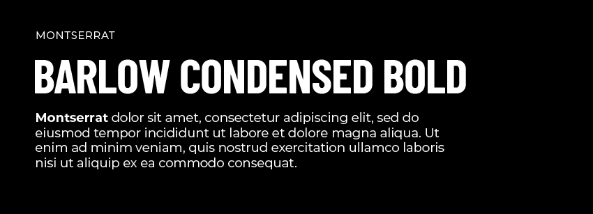
The combination of Barlow Condensed and Montserrat is a harmonious blend of modern aesthetics and functional design. This pairing offers a sleek, professional look that enhances readability and visual appeal.
Barlow Condensed: The Modern Condensed Sans-Serif
Barlow Condensed is a versatile sans-serif font characterized by its narrow letterforms and clean lines. It’s designed for both display and text use, making it suitable for headlines, subheadings, and even body text in some contexts. Barlow Condensed offers a contemporary, streamlined look that is both distinctive and legible.
Montserrat: The Geometric Sans-Serif
Montserrat is a popular geometric sans-serif font inspired by the signage found in the Montserrat neighborhood of Buenos Aires. Its balanced letterforms and clean, simple design make it an excellent choice for body text. Montserrat provides a modern, professional feel that is both approachable and versatile.
Why This Pairing Works
- Contrast and Cohesion: The narrow, condensed style of Barlow Condensed creates a striking contrast with the more open, geometric shapes of Montserrat. This contrast helps establish a clear visual hierarchy while maintaining a cohesive overall look.
- Modern Aesthetic: Both fonts share a modern and clean design ethos, making them suitable for contemporary websites. They work well together to create a sleek and polished appearance.
- Readability: Montserrat’s clear and open design ensures excellent readability for body text, while Barlow Condensed’s narrower forms are perfect for headlines and subheadings, drawing attention without sacrificing legibility.
Use Case Scenarios
- Corporate Websites: Use Barlow Condensed for headlines and section titles to create a strong visual impact. Montserrat can then be used for the body text and detailed content, ensuring clarity and readability.
- E-commerce Sites: Implement Barlow Condensed for product names and categories to highlight them effectively. Montserrat’s versatility makes it ideal for product descriptions, reviews, and other detailed information.
- Tech Startups and Blogs: Utilize Barlow Condensed for article titles and key highlights. Montserrat can handle the main content, providing a clean and professional reading experience.
Sample Implementation
- Headlines (H1, H2, H3): Apply Barlow Condensed to give your headings a distinctive and modern look.
- Body Text (P, Span): Use Montserrat for paragraphs and extended text, ensuring the content is easy to read.
- Navigation and Buttons: Employ Montserrat to maintain consistency and readability across interactive elements, while Barlow Condensed can be used for emphasis in call-to-action buttons.
Pairing Barlow Condensed and Montserrat creates a dynamic and professional look for your website. Barlow Condensed’s modern and narrow design complements Montserrat’s clean and geometric forms, resulting in a visually appealing and readable combination. This pairing is adaptable to various web design needs, providing a contemporary and polished appearance.
Roboto (Black) and Nunito Font Pairing
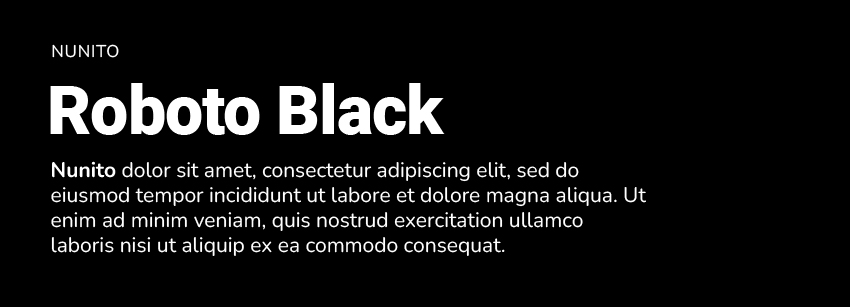
Domo arigato. The combination of Roboto and Nunito is a sophisticated and versatile choice for web design. This pairing merges the modernity and clarity of Roboto with the friendly and balanced nature of Nunito, resulting in a harmonious and user-friendly experience.
Roboto: The Modern Sans-Serif
Roboto is a widely-used sans-serif font designed with a dual nature: it has a mechanical skeleton and the forms are largely geometric. At the same time, the font features friendly and open curves. Roboto is highly readable and works well across various screen sizes and devices, making it a reliable choice for both headlines and body text.
Nunito: The Friendly and Rounded Sans-Serif
Nunito is a well-balanced sans-serif font with rounded terminals, which gives it a warm and welcoming appearance. It was originally designed as a display font but has since been expanded to include a full set of weights and styles, making it versatile enough for both display and body text.
Why This Pairing Works
- Contrast and Harmony: Roboto’s more geometric and straightforward design contrasts nicely with Nunito’s rounded and friendly curves. This contrast helps to create a clear visual hierarchy while maintaining a cohesive overall look.
- Readability and Aesthetics: Both fonts are highly readable, but they bring different aesthetics to the table. Roboto’s modern and clean lines complement Nunito’s approachable and friendly style, making the combination suitable for various types of content.
- Versatility: Both fonts come in multiple weights and styles, providing flexibility in design and ensuring consistency across different sections of a website.
Use Case Scenarios
- Corporate and Professional Websites: Use Roboto for headlines and key sections to create a modern and professional impression. Nunito can be used for body text to add a touch of friendliness and approachability to the content.
- Educational Websites and Blogs: Implement Roboto for article titles and headers to ensure clarity and structure. Nunito’s warmth and readability make it ideal for detailed content and paragraphs.
- Creative and Personal Websites: Utilize Roboto for navigation menus and calls to action, while Nunito can be used for main content and descriptions to create a welcoming and engaging user experience.
Sample Implementation
- Headlines (H1, H2, H3): Apply Roboto to give your headings a modern and clean look.
- Body Text (P, Span): Use Nunito for paragraphs and extended text to ensure readability and a friendly tone.
- Navigation and Buttons: Employ Roboto for navigation items and buttons to maintain consistency and ease of use, while Nunito can be used for any secondary or supporting text elements.
Pairing Roboto and Nunito creates a balanced and user-friendly design for your website. Roboto’s modern and clean design complements Nunito’s warm and approachable style, resulting in a visually appealing and highly readable combination. This pairing is versatile and adaptable to various web design needs, providing a contemporary and polished appearance.
Poppins (Bold) and Lora Font Pairing
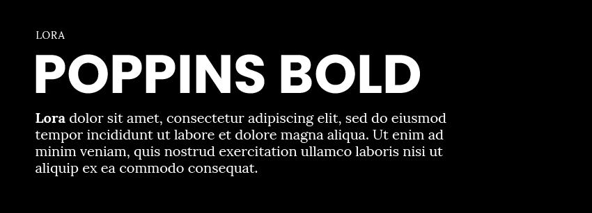
The combination of Poppins and Lora brings together the best of both geometric sans-serif and modern serif typography. This pairing is perfect for creating a website that is both visually appealing and highly readable.
Poppins: The Geometric Sans-Serif
Poppins is a geometric sans-serif font known for its clean and bold letterforms. It features a simple and modern aesthetic with a focus on circular shapes and minimalistic design. Poppins works well in both display and body text contexts, making it versatile for various design needs.
Lora: The Modern Serif
Lora is a contemporary serif font inspired by calligraphy. It has a balanced and elegant design with well-defined curves and strokes, providing a classic yet modern look. Lora is excellent for body text due to its readability and subtle sophistication.
Why This Pairing Works
- Contrast and Balance: The stark, geometric shapes of Poppins provide a strong contrast to Lora’s elegant and flowing serifs. This contrast creates a dynamic visual hierarchy, making headings stand out while ensuring body text remains readable and engaging.
- Modern and Classic Fusion: Combining the modern, clean lines of Poppins with the classic, calligraphic touches of Lora results in a balanced aesthetic that appeals to a broad audience. This fusion is particularly effective in professional and creative contexts.
- Readability and Versatility: Both fonts are designed for excellent readability. Poppins works well for headlines and larger text, while Lora’s serifs make long paragraphs easier to read, reducing fatigue for the reader.
Use Case Scenarios
- Professional Blogs and Articles: Use Poppins for article titles and section headers to create a strong visual impact. Lora can be used for the main content, ensuring that readers find the text engaging and easy to follow.
- Corporate Websites: Implement Poppins for navigation menus, headings, and key highlights. Lora’s refined appearance makes it suitable for detailed content, such as company history, mission statements, and blog posts.
- Creative Portfolios: Showcase your projects with Poppins for project titles and Lora for descriptions and case studies. This pairing highlights creativity while maintaining a professional and polished look.
Sample Implementation
- Headlines (H1, H2, H3): Apply Poppins to give your headings a bold and modern look.
- Body Text (P, Span): Use Lora for paragraphs and extended text to ensure readability and a sophisticated tone.
- Navigation and Buttons: Employ Poppins for navigation items and buttons to maintain consistency and ease of use, while Lora can be used for any secondary or supporting text elements.
Pairing Poppins and Lora creates a visually appealing and balanced design for your website. Poppins’ geometric and clean design complements Lora’s elegant and readable serifs, resulting in a harmonious combination that enhances both the aesthetic and functional aspects of your site. This pairing is versatile and adaptable to various web design needs, providing a modern and sophisticated appearance.
Merriweather and Source Sans Pro Font Pairing
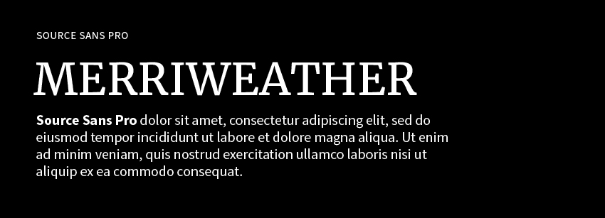
The combination of Merriweather and Source Sans Pro creates a sophisticated and readable design, perfect for content-rich websites. This pairing blends the classic elegance of a serif font with the modern clarity of a sans-serif, making it ideal for a wide range of applications.
Merriweather: The Classic Serif
Merriweather is a highly readable serif font designed for digital screens. It features a moderate contrast in stroke weight, making it both elegant and easy to read. The slightly condensed letterforms and sturdy serifs give Merriweather a timeless and professional appearance, perfect for headings and body text.
Source Sans Pro: The Modern Sans-Serif
Source Sans Pro is Adobe’s first open-source typeface family designed specifically for user interfaces. It is a clean, simple, and highly legible sans-serif font. Its well-balanced proportions and versatility make it an excellent choice for body text, navigation menus, and various other design elements.
Why This Pairing Works
- Contrast and Complement: The traditional, structured design of Merriweather provides a striking contrast to the clean, modern lines of Source Sans Pro. This contrast helps establish a clear visual hierarchy, making headings stand out while ensuring body text is easily readable.
- Readability: Both fonts are optimized for readability, making them suitable for content-heavy websites. Merriweather’s classic serif design enhances the readability of long-form content, while Source Sans Pro’s clarity and simplicity are perfect for shorter text blocks and user interface elements.
- Versatility: This pairing works well across various devices and screen sizes, maintaining legibility and aesthetic appeal. It is versatile enough for professional blogs, corporate websites, and educational platforms.
Use Case Scenarios
- Professional Blogs and Articles: Use Merriweather for article titles and section headers to create an elegant and authoritative tone. Source Sans Pro can be used for the main content, ensuring a clean and readable experience.
- Corporate Websites: Implement Merriweather for key sections such as mission statements, history, and major headings. Source Sans Pro works well for navigation menus, subheadings, and detailed content, creating a balanced and professional look.
- Educational Platforms: Utilize Merriweather for course titles, major announcements, and highlighted text. Source Sans Pro is perfect for lesson content, user interfaces, and detailed descriptions, making the educational material engaging and easy to read.
Sample Implementation
- Headlines (H1, H2, H3): Apply Merriweather to give your headings a classic and professional look.
- Body Text (P, Span): Use Source Sans Pro for paragraphs and extended text to ensure clarity and readability.
- Navigation and Buttons: Employ Source Sans Pro for navigation items and buttons to maintain consistency and ease of use, while Merriweather can be used for any secondary or supporting text elements.
Pairing Merriweather and Source Sans Pro creates a balanced and sophisticated design for your website. Merriweather’s classic and readable serifs complement Source Sans Pro’s modern and clean sans-serif style, resulting in a harmonious combination that enhances both the aesthetic and functional aspects of your site. This pairing is versatile and adaptable to various web design needs, providing a polished and professional appearance.
